Sentiment Analysis with Hugging Face and Deepgram
Saarth Shah

Sentiment analysis charts provide a visually informative way to track and understand shifts in sentiment over time. These data visualizations can offer insights into customer perceptions, brand reputation, market trends, and more.
With a little bit of customization and with the help of powerful AI technologies like Deepgram and Hugging Face, you can build your own sentiment analysis tool. By the end of this tutorial, you will have a sentiment analysis tool that produces beautiful charts to display the sentiment patterns of any audio clip.
Setting up the Notebook
Our project will contain a Jupyter notebook to document our sentiment analysis pipeline. You can see a finished example here.
We will first create two files - a notebook.ipynb file and a requirements.txt file.
Here are the packages our project will use:
transformers
numpy
pandas
matplotlib
seaborn
scipy
deepgram-sdk
python-dotenv
torch
pytube
Transcribing audio with Deepgram
The first step involves converting the audio data into text -- a format that our NLP models can understand for sentiment analysis.
Choose audio or video file
We will save the audio file to a ./data folder inside the parent directory. In the example project, we actually use a YouTube video rather than an audio file. In order to use a YouTube video, we need to convert it to an audio file such as an mp3. This is how we can do this in Python:
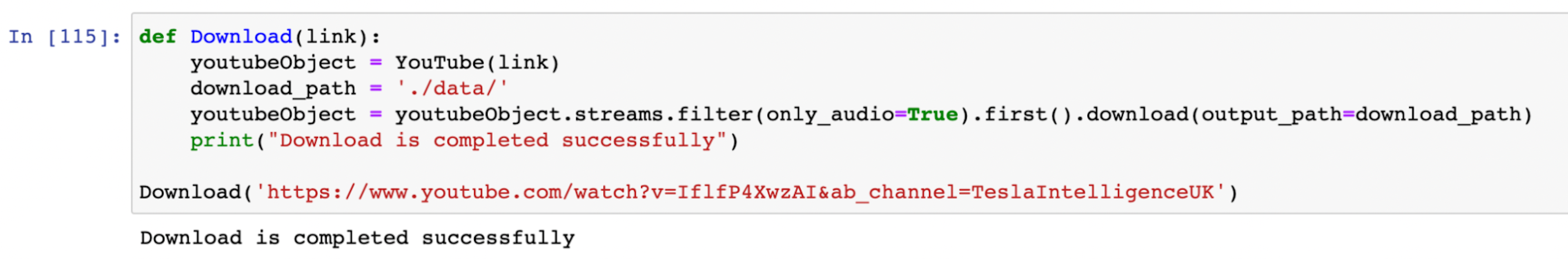
Now we have an mp3 file that we can send to Deepgram to be transcribed.
API request to Deepgram
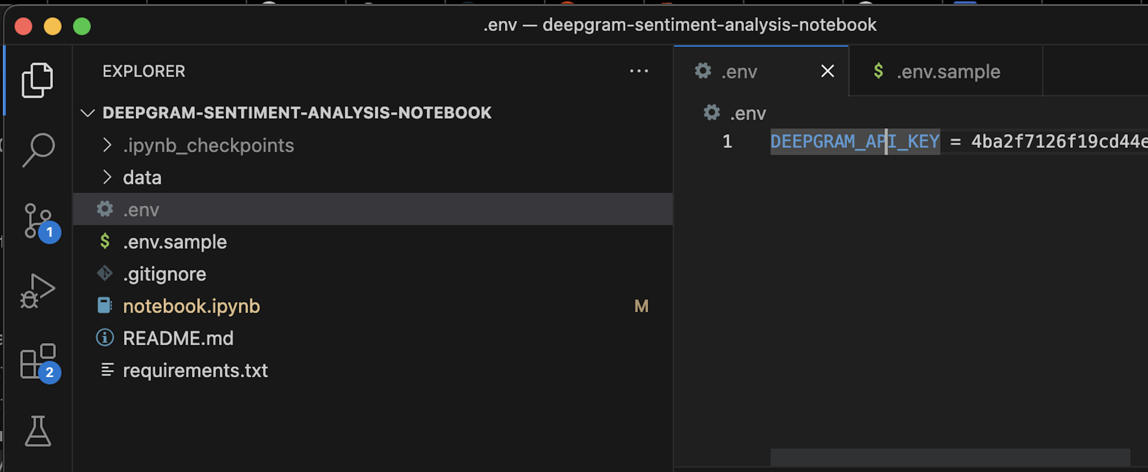
We will need to get an API key from Deepgram. We can head over to console.deepgram.com and create an account (it won’t cost anything to start using the API).
Then we’ll create a .env file in the project, where we will add our API key.
To interact with Deepgram, we will be using the deepgram-python-sdk. Here’s the code to make our request:
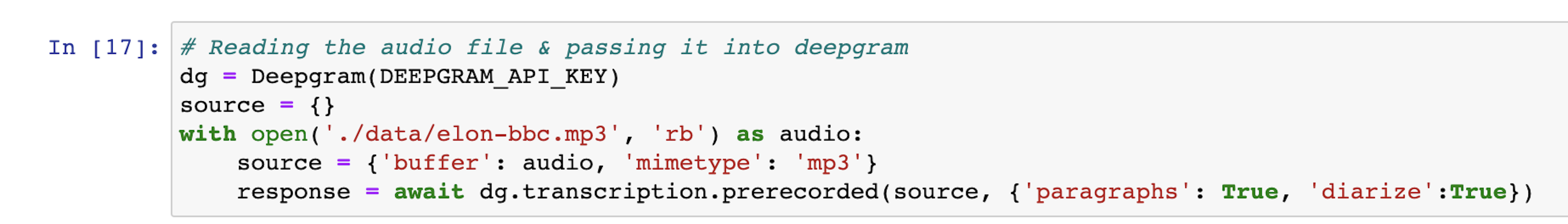
Notice the code {‘paragraphs’: True, ‘diarize’: True }. This tells Deepgram to use the paragraphs and diarization features. Our sentiment analysis tool relies on these features, so we need to be sure to turn them on.
A successful Deepgram response will look something like this:
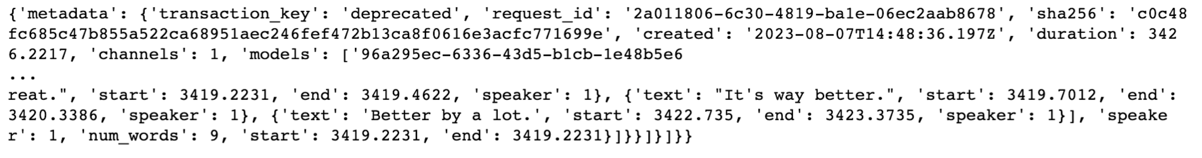
Later in this tutorial, we’ll format the data above into the form we need for the sentiment analysis.
Setting up the Sentiment Analysis Pipeline with Hugging Face
Next, we will write the code that actually does the sentiment analysis.
Hugging Face Transformers Pipeline
The Hugging Face pipeline API is a simplified way to use pre-trained models to perform NLP tasks (such as sentiment analysis) without needing to write complex code. The model we will use is the Twitter RoBERTa base model. We will use this model because of its ability to handle short, informal text typically found on social media platforms such as Twitter.
Using this one line of code, we can run this Hugging Face model in our Jupyter notebook.
sentiment_analysis = pipeline("sentiment-analysis",model="cardiffnlp/twitter-roberta-base-sentiment",top_k=3)Note the use of the top_k = 3 method, which forces the sentiment analysis pipeline to return the scores for all the 3 sentiment classifications:
Neutral Statement
Positive Statement
Negative Statement
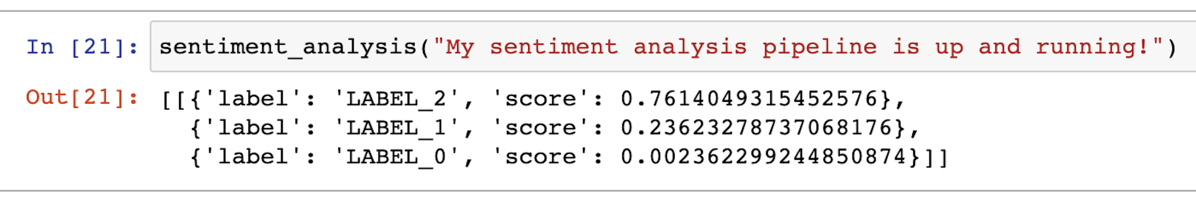
'LABEL_1' refers to a neutral statement, 'LABEL_2' to a positive statement, and 'LABEL_0' to a negative statement.
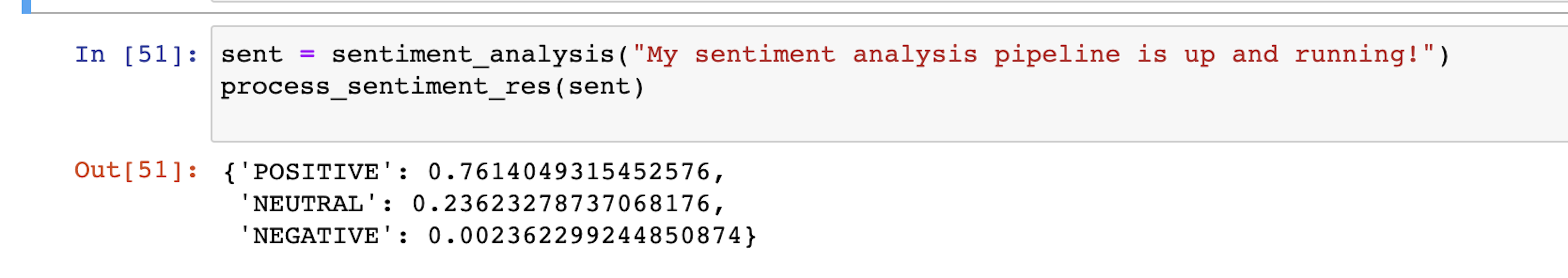
Let's write a function that replaces the labels with 'POSITIVE', 'NEGATIVE' and 'NEUTRAL'. This will make the results more human-readable.
def process_sentiment_res(sent):

    res = {}
    for s in sent[0]:
        if s['label'] == 'LABEL_2':
            label = 'POSITIVE'
        elif s['label'] == 'LABEL_0':
            label = 'NEGATIVE'
        else:
            label = 'NEUTRAL'
        res[label] = s['score']

    return res
Now we have this. The output is much easier to understand:
Convert output into one composite sentiment score
The next step is to write a function to convert these three probabilities into a single composite score. We will do this so we can have one simple representation of the sentiment that we can use to create our sentiment chart in the next section.
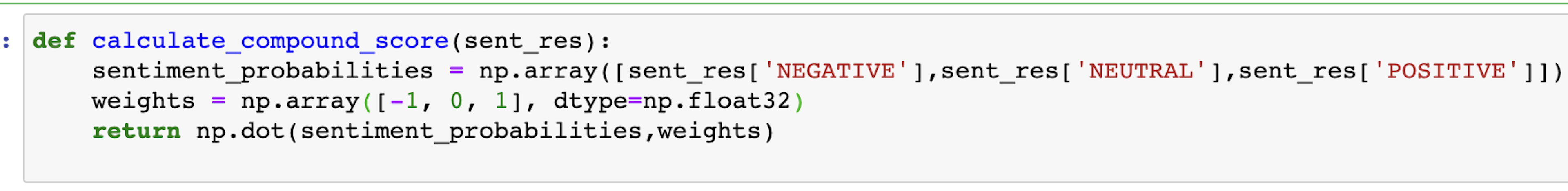
The function calculate_compound_score calculates a compound sentiment score based on a set of sentiment probabilities and corresponding weights.
calculate_compound_score(process_sentiment_res(sent))
Here is the breakdown for how this function uses the Python package NumPy to do the calculation:
Sentiment Probabilities Extraction: The sentiment probabilities for the three categories ('NEGATIVE', 'NEUTRAL', 'POSITIVE') are stored in a NumPy array. This array is extracted from the sent_res dictionary.
Weights Array: The corresponding weights for each sentiment category ('NEGATIVE', 'NEUTRAL', 'POSITIVE') are also stored in a NumPy array. These weights are floating-point values: [-1.0, 0.0, 1.0].
Dot Product Calculation: The core calculation involves the dot product between the sentiment probabilities array and the weights array. The dot product operation is used to calculate the sum of the products of corresponding elements in the two arrays.
Now let's put all this logic together and build a single function that takes in a statement (as a string) and returns a compound score.
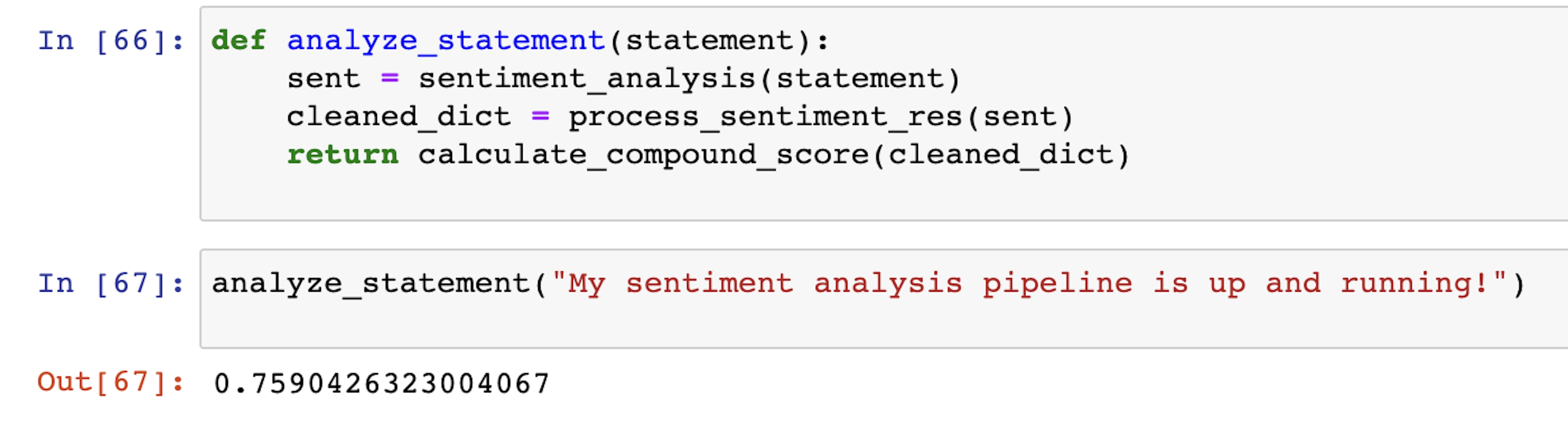
Now we have a composite score that can serve as a point in the chart to represent the sentiment by a certain speaker at a certain time.
The next thing to do is run this on the Deepgram transcription so we can get these points for all the language spoken in the YouTube video we are analyzing.
Turn the data into a sentiment chart
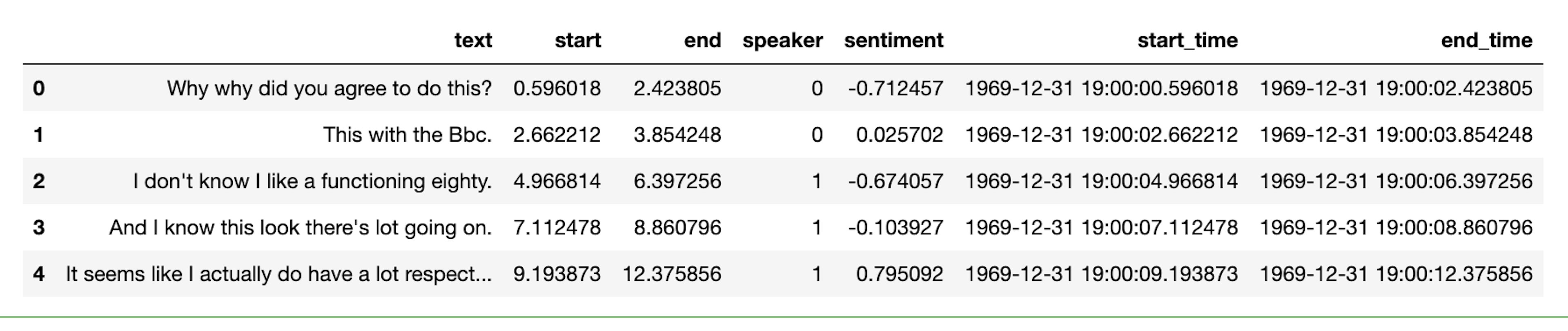
Let’s go back to the transcript we received from Deepgram. We will turn this into a readable transcript based on the individual paragraphs.
all_sentences = response['results']['channels'][0]['alternatives'][0]['paragraphs']['paragraphs']To make it easier for us to organize everything in the pandas data frame, we will write some custom code that uses the paragraphs portion of the Deepgram transcript and creates a pandas DataFrame.
result = []

for s in all_sentences:
    speaker_sentences = s['sentences']
    for sentence in speaker_sentences:
        sentence['speaker'] = s['speaker']
        result.append(sentence)
df = pd.DataFrame(result)

df.head()
Now let's run the sentiment analysis function we built on this Deepgram transcript. We will also add two columns - start_time, and end_time - that use the start and end second timestamps provided by Deepgram and convert them into an arbitrary datetime object.
df['sentiment'] = df['text'].apply(analyze_statement)
df['start_time'] = df['start'].apply(lambda x: datetime.datetime.fromtimestamp(x))
df['end_time'] = df['end'].apply(lambda x: datetime.datetime.fromtimestamp(x))

df.head()
Here’s our resulting DataFrame:
By doing some quick exploratory data analysis, we can get insights into the overall results of the podcast.
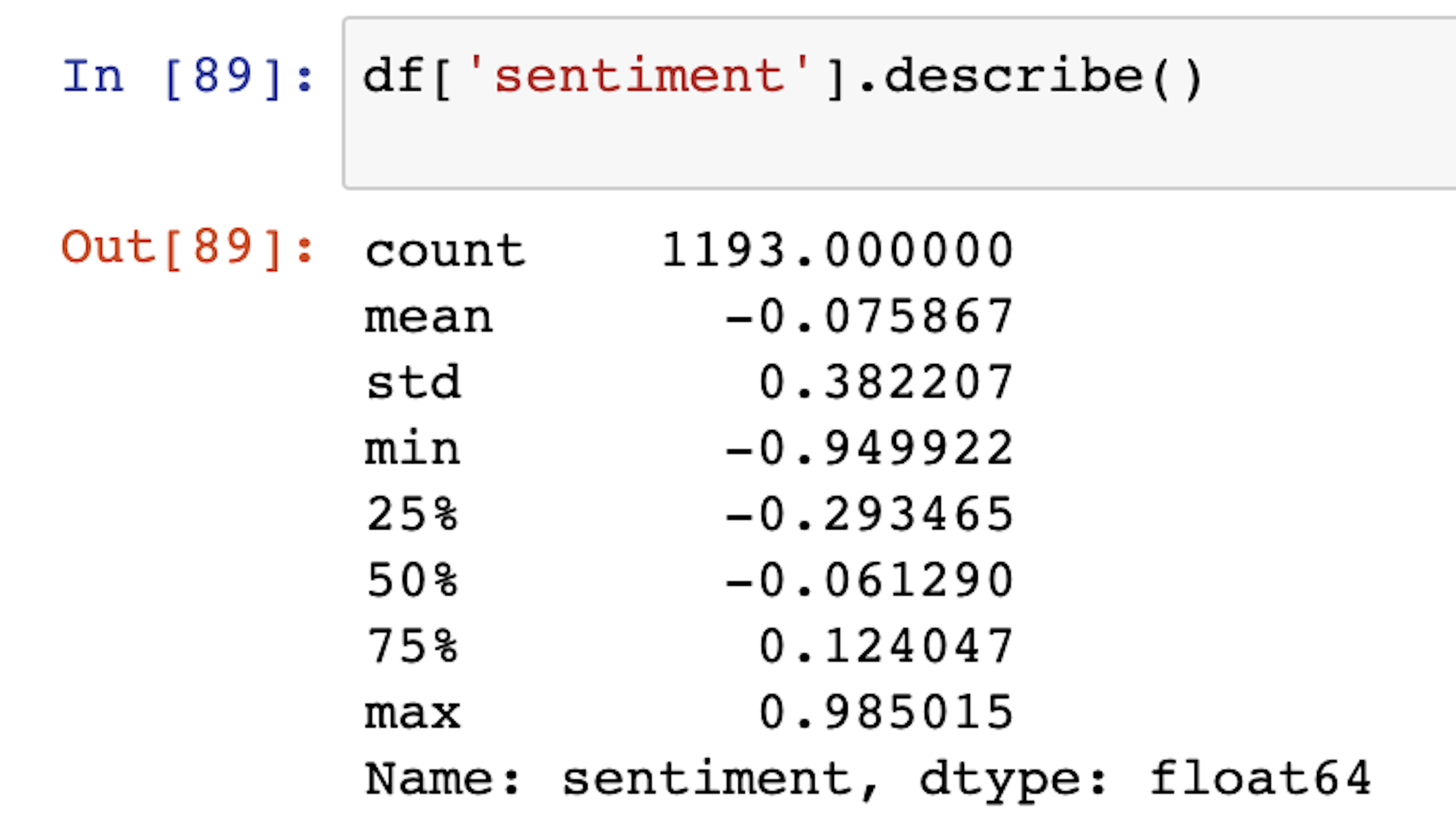
Looking at the overall summary of the results, it is evident that on average, the podcast was primarily neutral with an average sentiment score of -0.07
Now that we know the time-wise sentiment of the speakers, we can plot the speaker-wise results to get an idea of how the sentiments changed over time as the podcast progressed.
Plotting the chart
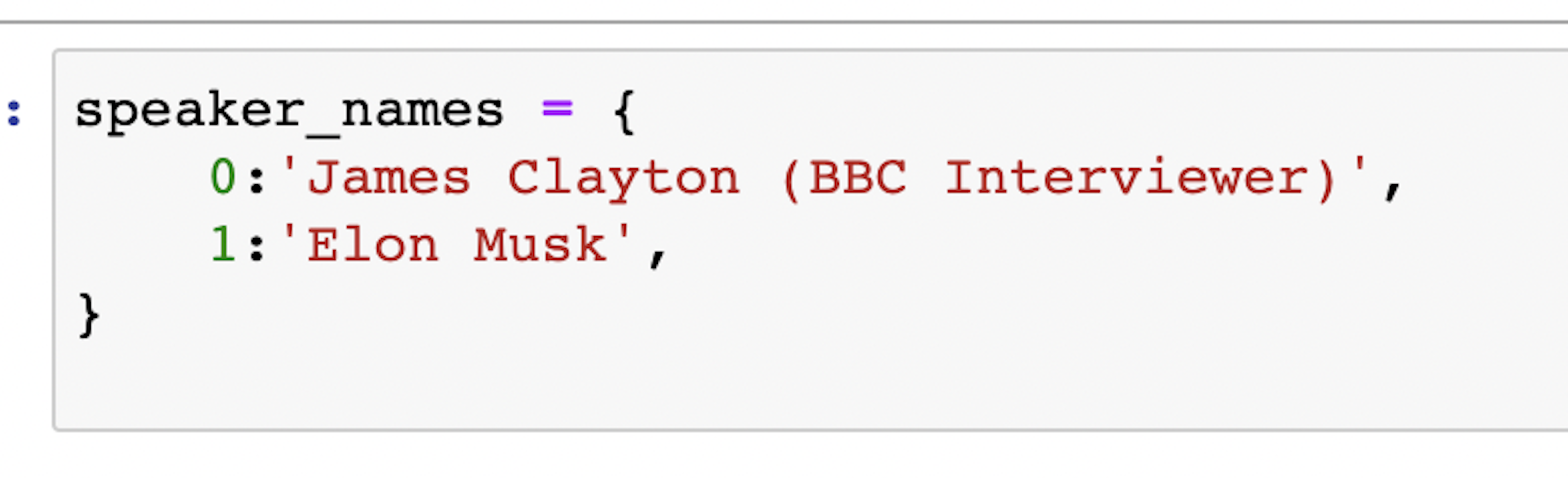
To make the charts more legible, we will manually create a dictionary of speaker codes with names.
Now that we have the speaker names, we can use Matplotlib and Seaborn to create sentiment analysis plots for the different speakers. Here’s the logic with a description of what each part does. You can see the whole thing in the project repo.
Create a grid of subplots to visualize the sentiment for different speakers:
fig, axis = plt.subplots(df['speaker'].max()+1,figsize=(10,20))Adjust the spacing between and margins between the subplots:
plt.subplots_adjust(left=0.1,
                    bottom=0,
                    right=0.9,
                    top=1,
                    wspace=0.4,
                    hspace=0.4)
Iterate through each subplot and set various properties to customize the appearance and content of the subplot:
for speaker,ax in enumerate(axis):
    ax.xaxis.set_major_formatter(mdates.DateFormatter('%M:%S'))
    ax.set_ylim(-1.2, 1.2)
    ax.set_xlabel('Time')
    ax.set_ylabel('Sentiment')
    ax.set_title(f'Elon Musk BBC Interview \n Speaker {speaker_names[speaker]} \n (Time-wise Sentiment Analysis)')
Extract data points corresponding to the current speaker:
datapoints = df[df['speaker']==speaker]Create a line plot showing sentiment scores over time for the current speaker:
ax.plot(datapoints['start_time'], datapoints['sentiment'])Add the reference lines:
   ax.axhline(0, color='gray', linestyle='--', label='Neutral')
   ax.axhline(1, color='green', linestyle='--', label='Positive')
   ax.axhline(-1, color='red', linestyle='--', label='Negative')
Add the legend:
ax.legend()Display the subplot:
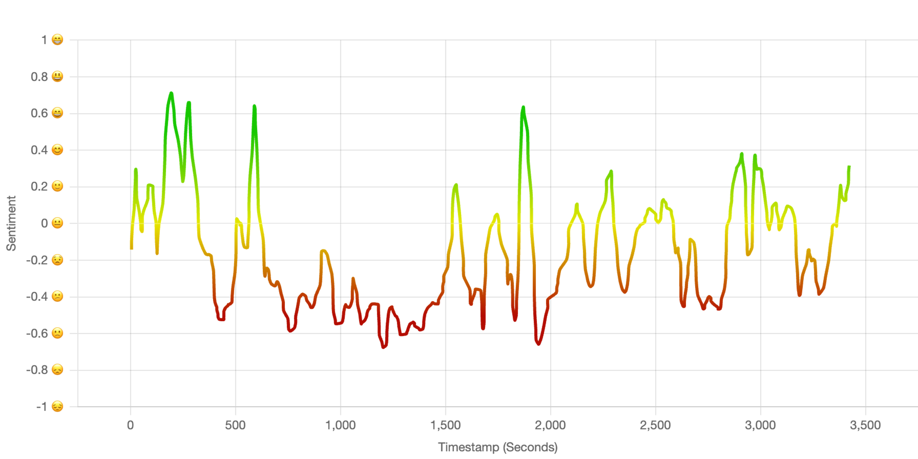
plt.show()Here’s the chart that we just created:
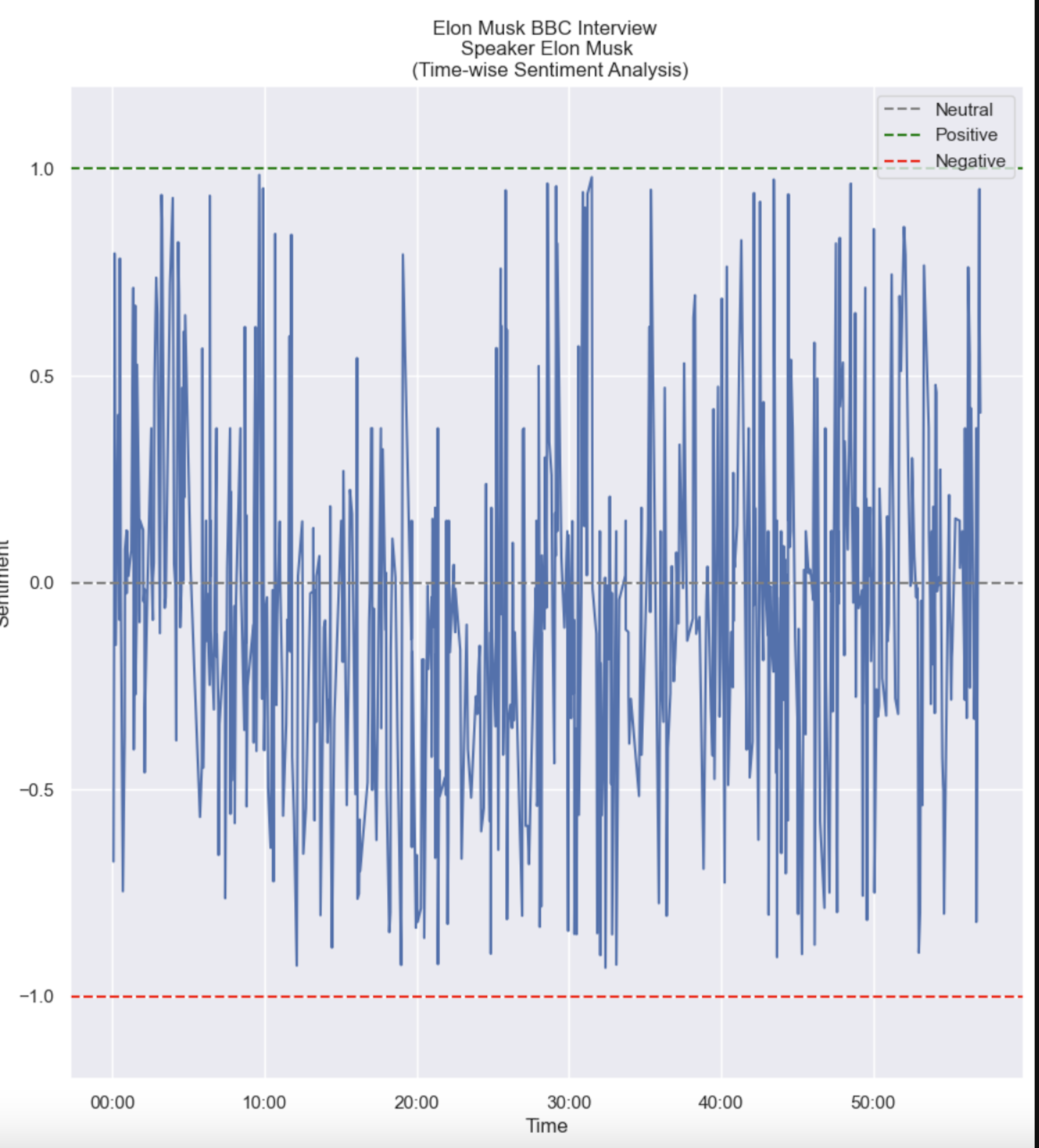
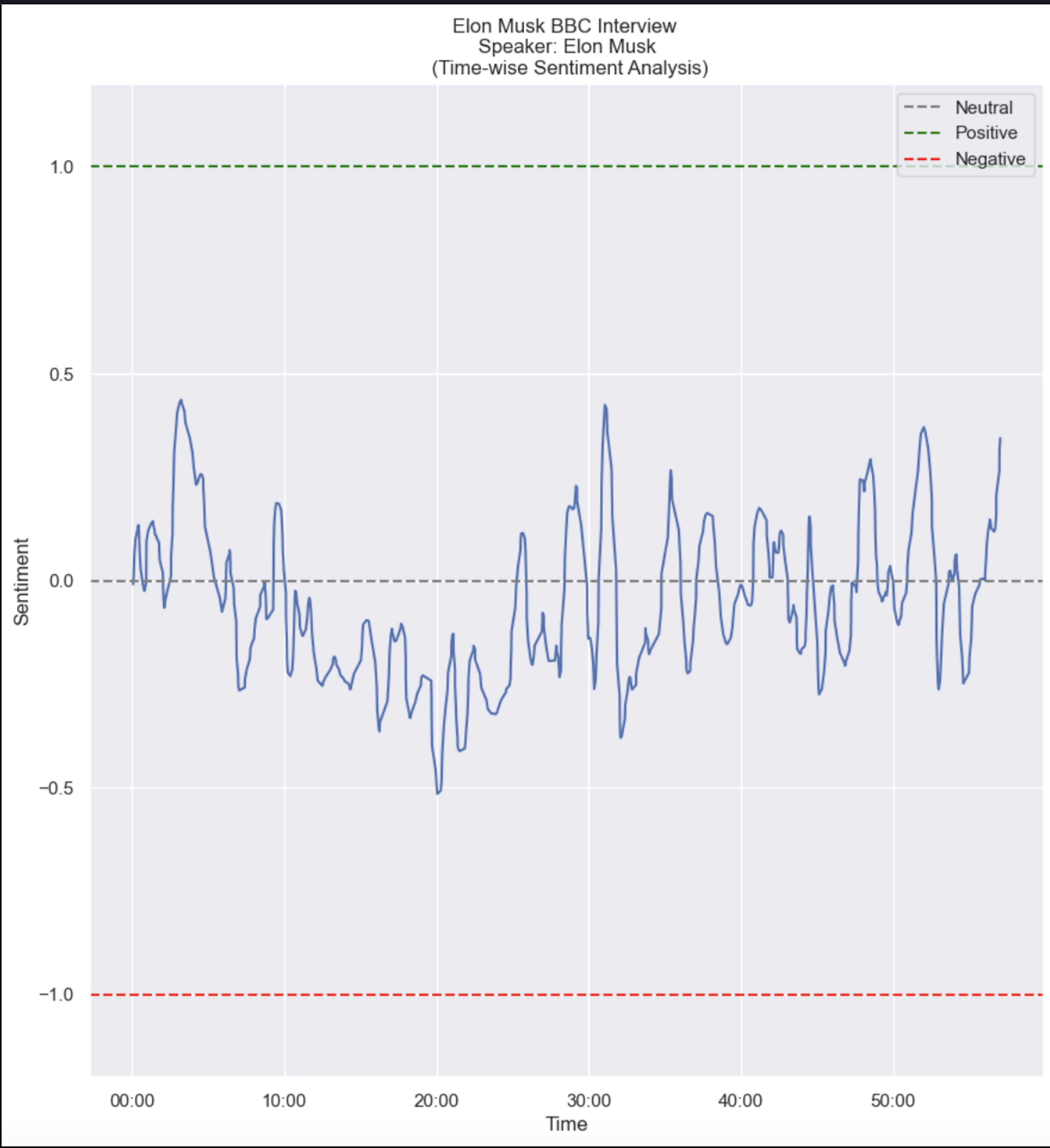
Smoothing
At first glance, you might be wondering why this chart is all over the place. This is because each sentence that the speaker said has separate sentiment values. However, we are more interested in the overall sentiment of the speaker at that point in time. To fix this, we can use what’s known as a smoothing technique.
We use a smoothing technique called a Gaussian filter, which softens sharp sentiment changes and outliers, making the trends easier to understand and more visually appealing.
The "sigma" (σ) value in a Gaussian filter decides how much the data gets smoothed - bigger values make it smoother but might remove some details, while smaller values keep more details but might not be very smooth. Picking the right sigma value is important to make the data look smoother without losing important information.
Here’s the full code to build the sentiment chart, including the smoothing logic:
fig, axis = plt.subplots(df['speaker'].max()+1,figsize=(10,20))
plt.subplots_adjust(left=0.1,
                    bottom=0,
                    right=0.9,
                    top=1,
                    wspace=0.4,
                    hspace=0.4)

for speaker,ax in enumerate(axis):
    ax.xaxis.set_major_formatter(mdates.DateFormatter('%M:%S'))
    ax.set_ylim(-1.2, 1.2)
    ax.set_xlabel('Time')
    ax.set_ylabel('Sentiment')
    ax.set_title(f'Elon Musk BBC Interview \n Speaker: {speaker_names[speaker]} \n
    (Time-wise Sentiment Analysis)')
      datapoints = df[df['speaker']==speaker]

# Apply Gaussian filter for smoothing

  sigma = 3  # Standard deviation for Gaussian kernel
  smoothed_scores_gaussian = gaussian_filter1d(datapoints['sentiment'], sigma)
  ax.plot(datapoints['start_time'], smoothed_scores_gaussian)
  ax.axhline(0, color='gray', linestyle='--', label='Neutral')
  ax.axhline(1, color='green', linestyle='--', label='Positive')
  ax.axhline(-1, color='red', linestyle='--', label='Negative')
  ax.legend()

plt.show()
This should produce a result that looks like this:
If you are familiar with plotting libraries like matplotlib, seaborn, d3js, or chart.js, you can further improve these charts:
Conclusion
In this tutorial, we built a sentiment analysis tool using Hugging Face and Deepgram API. We learned how to combine these two powerful technologies to analyze any video/audio clips for their sentiments.